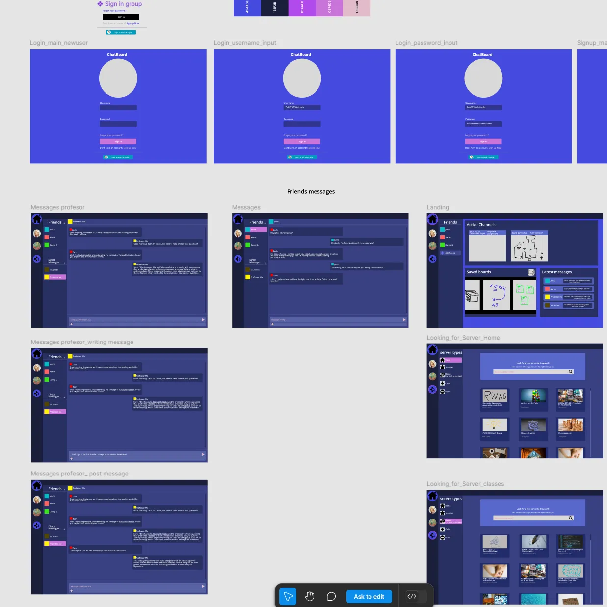
Chatboard
UX Research & Usability Study — RIT HCI
Figma
Students hate using Slack and Discord for class. Why?
During and after COVID-19, students were pushed into tools like Zoom, Discord, and Slack for academic communication. These programs weren't designed for education — and students knew it. In preliminary interviews, students described Discord as "not professional enough" and said they actively disliked using Slack for coursework.
More than 80% of participants were using digital backchannel programs multiple times a week for academic reasons — and yet many were unsatisfied with what was available. The core problem: every existing tool was either too casual, too enterprise, or spread across too many separate apps.
My goal was to design and test a classroom-native alternative — a single platform that combined the communication features students rely on, purpose-built for an academic environment.
Chatboard: One app built for students
I designed Chatboard in Figma as a digital backchannel that integrates features from existing tools into a single, classroom-focused platform. The key differentiator was a built-in collaborative whiteboard — allowing students to share ideas visually within the same environment where they were already communicating.
The UI deliberately drew on Discord and Slack's familiar layout patterns to reduce onboarding friction, while introducing a structure designed around academic workflows: organized by class, not by server or workspace.
"I liked the diagram part. I think it's interesting — there's a public whiteboard for every student to share something. You need that visual, especially for an online feature."
— Participant 4
"The whiteboard aspect is very interesting. There's been many times in a chat where it'd be very useful to use drawing. To do that you'd need to share your screen and go to an external program. So having something built in seems super valuable."
— Participant 1
How the study was structured
Preliminary Interviews
Conducted one-on-one interviews to understand how students were currently using digital backchannels and what pain points they experienced with existing tools.
Prototype Design in Figma
Built a high-fidelity interactive prototype in Figma, incorporating features identified during preliminary research — including the signature collaborative whiteboard.
Usability Testing — 21 Participants
Recruited participants ranging from second-year undergraduates to PhD students at RIT — all regularly using digital backchannels in coursework. Each completed 5 structured tasks while thinking aloud.
Pre-Task Survey + Exit Interviews
Collected baseline data on current tool usage before testing, then conducted exit interviews to capture deeper qualitative feedback on the prototype and existing tools.
Mixed Methods Analysis
Analyzed quantitative task data (completion rates, time-on-task, click counts) and qualitative interview data through thematic coding, then synthesized across both datasets.
What the data showed
Participants completed five tasks simulating a new student's first experience with Chatboard. The results revealed which interaction patterns worked — and where the design needed refinement.
| Task | Goal | Completion | Key Finding |
|---|---|---|---|
| Task 1 | Create a new account | 100% | Single clear path; no ambiguity in onboarding flow |
| Task 2 | Navigate to a classroom | 95.2% | 14 of 21 users needed clarification — non-interactive UI elements caused confusion |
| Task 3 | Send a public chat message | 95.2% | Highest researcher intervention rate — only 3 clicks needed once understood |
| Task 4 | DM the professor | 85.7% | 11 participants frustrated by missing shortcut to professor — a near-universal expectation |
| Task 5 | Draw on the whiteboard | 100% | Prior app experience accelerated completion — learnability improved over time |
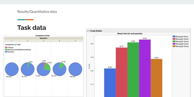
Quantitative results from usability testing across 21 participants, measuring task completion rates, error counts, and time-on-task for each core workflow.
Four themes from participant interviews
Prototype Limitations
17 of 21 participants identified issues in three areas: a non-interactive sidebar creating false affordances, missing navigation shortcuts, and the absence of hover states users expected.
Whiteboard Was the Standout
Consistently cited as the most compelling differentiator — something participants hadn't seen in existing classroom tools and identified as genuinely useful for group work and instruction.
Frustration with Existing Tools
Discord felt too informal, Slack felt disconnected from coursework, and professors were often hard to reach on both platforms.
Strong Preference for Chatboard
Despite usability issues, the majority said they'd prefer Chatboard over their current tools if it were a finished product.
"I would definitely use it if it became an app. It combines Discord features with things you actually need in class."
— Participant 18
"I like that you have the teacher participating — they don't participate in Discord."
— Participant 11
What I learned
This was my first time designing and running a full usability study from scratch. A few takeaways I'd carry into future work:
- Non-interactive UI elements that look interactive are a silent UX killer. They don't show up in a design review — you only find them when you watch someone use the thing.
- Users build mental models fast. By task 5, participants who struggled on task 2 were navigating confidently — learnability matters as much as discoverability.
- The first task in the study wasn't pulling its weight. I'd cut it in a second iteration — it added time without producing useful data.
- The next step for Chatboard would be building it in JavaScript so it can be tested in a live environment, enabling interactions Figma simply can't simulate.